.jpg?width=300&name=Blog%20Link%20Preview%20Image%20(37).jpg)
In a world overflowing with data, harnessing the potential of data visualization has become a key asset for researchers and open-source investigators alike, enabling them to derive meaningful conclusions.
In this blog, we will explore the pivotal role data visualization plays in today's data-centric landscape, some of its benefits, and real-world case studies, arming you with the necessary knowledge to understand the visual realm of data and enhance your professional endeavors.
What is Data Visualization, and Why Does It Matter?
Data visualization is the graphical representation of data and information using visual elements such as charts, graphs, and maps (whether geospatial or conceptual, like network maps).
By transforming raw data into clear, intuitive, and interactive visuals, it unlocks valuable insights that might otherwise remain hidden in spreadsheets and reports.
With attention spans getting shorter, visuals capture attention and convey information efficiently, enhancing comprehension and driving impactful decision-making.
Whether it's business analytics, scientific and investigative research, or public policy, data visualization empowers decision-makers to easily understand patterns, identify trends, and communicate complex information.
Benefits of Data Visualization
Data visualization offers several benefits that contribute to contextual understanding and informed decision-making:
Enhanced Data Exploration
Data visualization enables researchers and investigators to explore large, complex datasets more efficiently.
Visual representations make identifying patterns, outliers, and relationships within the data easier, leading to deeper insights and discoveries.
Improved Data Understanding
Visualizing data helps researchers and investigators grasp the underlying meaning and context more effectively.
By representing data visually, complex concepts become easier to understand, allowing for clearer comprehension and interpretation.
Efficient Communication
Visualizations simplify the communication of research findings and investigative results to both technical and non-technical audiences.
Visual representations can convey complex information concisely and understandably, fostering effective communication and knowledge sharing.
Identifying Trends and Patterns
Data visualization also facilitates the identification of trends, patterns, and correlations within datasets.
Visual representations can reveal hidden relationships or insights that might not be apparent in raw data alone, enabling researchers and investigators to make connections and draw meaningful conclusions.
Detecting Anomalies and Outliers
Data visualization allows researchers and investigators to identify anomalies, outliers, or irregularities within datasets.
Visual representations make it easier to spot unusual data points or patterns that may require further investigation, helping to detect fraud, errors, or other irregularities.
Supporting Hypothesis Testing
Visualizing data helps researchers and investigators validate or invalidate hypotheses.
By examining data visually, researchers can visually explore the relationship between variables, test assumptions, and verify the validity of their theories.
Facilitating Decision-Making
Visualizations provide a visual framework for making data-driven decisions.
By presenting data in an easily understandable format, the ultimate consumers of research and investigative work can analyze the information, consider various factors, and make informed decisions more efficiently.
Enabling Data-Driven Storytelling
Data visualization enhances storytelling by allowing researchers and investigators to present data-driven narratives.
Visual representations can be used to construct compelling narratives that convey the key findings, insights, and implications of the research or investigation coherently and engagingly.
Common Data Visualization Use Cases in Research and Open Source Investigations
Data visualization has crucial role in research and open source investigations, helping analysts and investigators gain valuable insights from complex datasets.
Here are some specific use cases where data visualization is particularly relevant:
Political Economy Analysis
Political economy analysis involves understanding the interactions between politics, economics, and social factors.
Data visualization can assist in representing complex relationships and dynamics within a political system.
For example, visualizing campaign finance data can reveal connections between political candidates and donors, providing insights into potential conflicts of interest and campaign funding patterns.
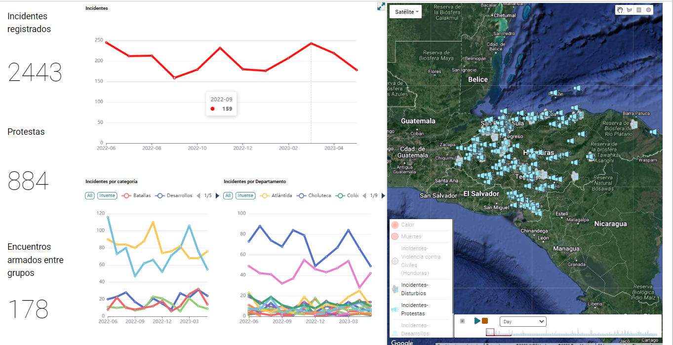
Conflict Mapping
In conflict mapping, data visualization is instrumental in depicting spatial and temporal patterns of conflict, identifying hotspots, and understanding the dynamics between different actors.
By mapping conflict incidents, casualties, and displacement, visual representations can provide a comprehensive view of the conflict landscape and help identify trends and underlying causes.
Environmental Assessments
Data visualization is valuable for analyzing environmental data and assessing the impact of human activities on ecosystems.
Visualizing data on pollution levels, deforestation rates, or carbon emissions can provide a clear understanding of environmental challenges and guide evidence-based decision-making. Interactive maps and charts can also facilitate spatial analysis and help identify vulnerable areas and plan conservation efforts.
Social Network Analysis
Social network analysis involves studying relationships between individuals or organizations.
Network graphs can reveal hidden patterns and connections.
In open source investigations, visualizing connections between individuals engaged in illicit activities or organizations at different steps of illegal supply chains can shed light on complex relationships that might not be apparent through traditional analysis methods.
Public Health Research
Data visualization is vital in public health research by visualizing patterns and trends in disease outbreaks, epidemiological data, and healthcare disparities.
Heatmaps, time series graphs, and interactive dashboards help identify disease clusters, track the spread of infectious diseases, and inform public health interventions.
Fraud Detection
Data visualization is crucial in detecting patterns and anomalies that may indicate fraudulent activities.
By visualizing financial transactions, customer behavior, or employee activities, organizations can identify suspicious patterns or outliers that might go unnoticed through traditional analysis methods.
Interactive dashboards, network graphs, and anomaly detection visualizations enable investigators to uncover potential fraud schemes and take appropriate measures to protect assets.
Text Analysis and Natural Language Processing
In open source investigations involving large volumes of text data, data visualization techniques such as word clouds, sentiment analysis charts, or topic modeling visualizations can provide insights into patterns, trends, and key themes.
These visual representations assist in identifying relevant information, exploring connections between entities, and extracting meaningful insights from textual data.
In these use cases, data visualization allows researchers and open-source investigators to explore, analyze, and communicate complex information effectively.
By transforming data into visual representations, it enables a deeper understanding of the subject matter and supports evidence-based decision-making.
It is worth noting that open source investigations often involve collecting and analyzing publicly available data from diverse sources.
Therefore, data visualization tools that can handle multiple data formats, integrate with APIs, and support data scraping capabilities are particularly valuable in these contexts.
Best Practices for Effective Data Visualization:
To maximize the impact of data visualization, following these best practices is crucial:
Understand the Audience
Tailor visualizations to the target audience's knowledge, interests, and preferences.
Consider the level of expertise and the specific insights they are seeking. Remember that, more often than not, less is more.
Keep it Simple
Avoid clutter and unnecessary complexity. Use clear and concise labels, colors, and visual elements to convey the intended message effectively.
Ensure It Is Useful
We often see pretty visualizations that don’t deliver anything useful.
Be mindful of not visualizing data for visualization’s sake and ensure every graph produced provides actionable value.
Provide Context
Contextualize the data by including relevant labels, titles, and descriptions. Clearly define axes and units to ensure accurate interpretation.
Choose the Right Visualization Type for the Job
Select a visualization type that best represents the data and supports the desired analysis. They all serve different purposes and are optimized for different use cases.
.jpg?width=1920&height=1080&name=Blog%20Link%20Preview%20Image%20(36).jpg)
Here are some types of charts available and their best-suited applications:
Bar Charts and Column Charts
Bar charts and column charts are popular choices for comparing discrete categories or groups.
These charts display data in rectangular bars or columns, where the length or height of each bar represents the value of the category it represents.
Bar charts are best suited for comparing different data points within a single category, while column charts work well for comparing data across multiple categories.
They are excellent for visualizing trends over time, analyzing survey results, and presenting categorical data like sales figures, market shares, or demographic distributions.
Line Charts
Line charts are ideal for showing trends and patterns in continuous data over time.
They use connected data points to illustrate the progression of a variable, making them perfect for visualizing time-series data, such as stock prices, temperature fluctuations, or website traffic over different periods.
Line charts enable viewers to spot trends, identify seasonal patterns, and detect changes in data over time with ease.
Pie Charts
Pie charts are effective for illustrating parts of a whole, displaying how a single data set is distributed among various categories.
The size of each slice in a pie chart represents the proportion of that category to the whole data set.
Pie charts are best suited for displaying relative percentages and helping viewers understand the composition of a whole, such as budget allocations, market share distributions, or survey responses based on multiple-choice questions.
Scatter Plots
Scatter plots reveal relationships between two continuous variables, each data point representing a combination of these variables.
They are useful for identifying correlations, clusters, or outliers in data and are particularly valuable for showing how two variables relate to each other.
Scatter plots are commonly used in scientific research, market analysis, and social sciences to visualize data points and identify patterns or trends in the data.
Heatmaps
Heatmaps use colors to represent data values across a matrix or grid.
They are excellent for visualizing complex data sets, such as geographic data, customer preferences, or user interactions on a website.
Heatmaps are particularly useful when dealing with large datasets where individual data points can be difficult to interpret but patterns and trends emerge when visualized in a heatmap format.
 Remember, the choice of the chart type depends on the nature of the data and the specific insights you want to convey.
By selecting the appropriate chart, you can present data more effectively and ensure that your audience gains a clear understanding of the information being presented.
What to Look for in a Data Visualization Tool?
Data visualization can be daunting and time-consuming. Choosing the right data visualization tool is essential to avoid drowning in data and create impactful visualizations.
When evaluating such tools, it helps to consider the following criteria:
- Ease of Use: Look for tools with intuitive interfaces and user-friendly features. Drag-and-drop functionality, pre-built templates, and interactive capabilities can streamline the visualization process and save you time and headaches.
- Flexibility and Customization: Ensure that the tool you choose provides options for customization, allowing you to tailor visualizations to specific needs. Look for features like customizable colors, labels, and formatting.
- Compatibility and Integration: Consider whether the tool integrates with your existing data sources and databases. Compatibility ensures seamless data connectivity and facilitates real-time updates, which can be critical in time-sensitive work.
- Interactive Capabilities: Interactive visualizations enable users to explore data dynamically, drill down into details, and gain deeper insights. Look for tools supporting interactivity and offering features like filtering, search, and zooming.
In Summary
Data visualization is vital in driving contextual understanding and informed decision-making across research and open-source investigations.
By transforming complex data into visual representations, it enables users to extract insights, communicate effectively, and make data-driven decisions.
When choosing a data visualization tool, consider factors such as ease of use, flexibility, integration capabilities, and interactivity.
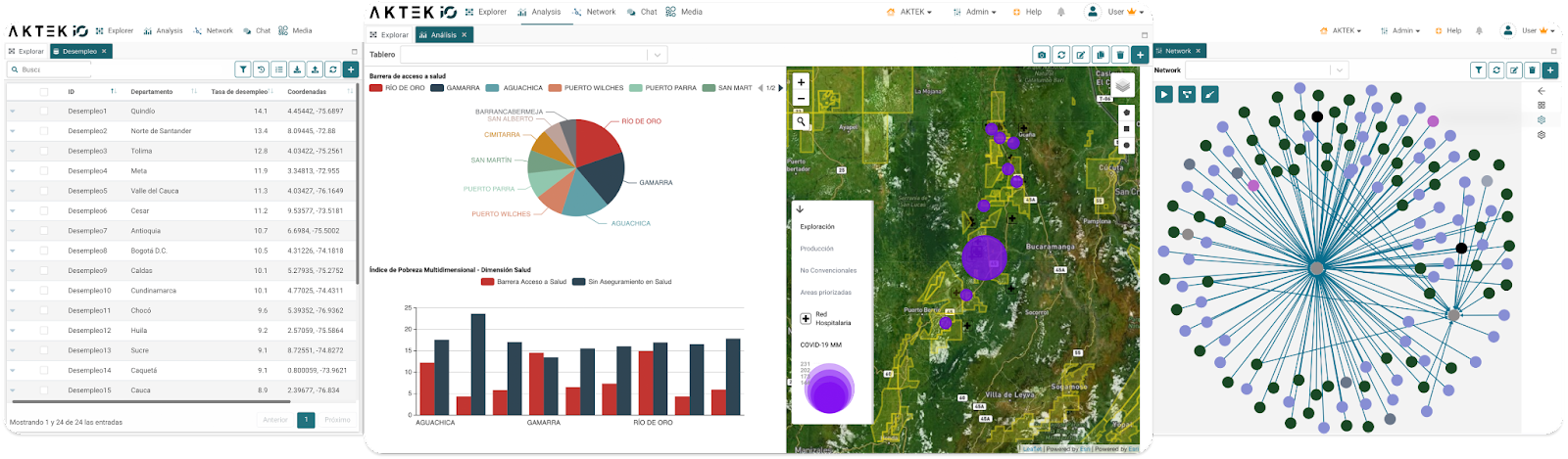
Innovative, no-code, end-to-end intelligence management platforms like AKTEK iO can help streamline your data visualization process and provide comprehensive solutions for managing and visualizing data effectively across the entire lifecycle of the information you work with.
If you’re interested in exploring how this can work for your organization, contact us, and we’ll be happy to explore with you.